
Brand

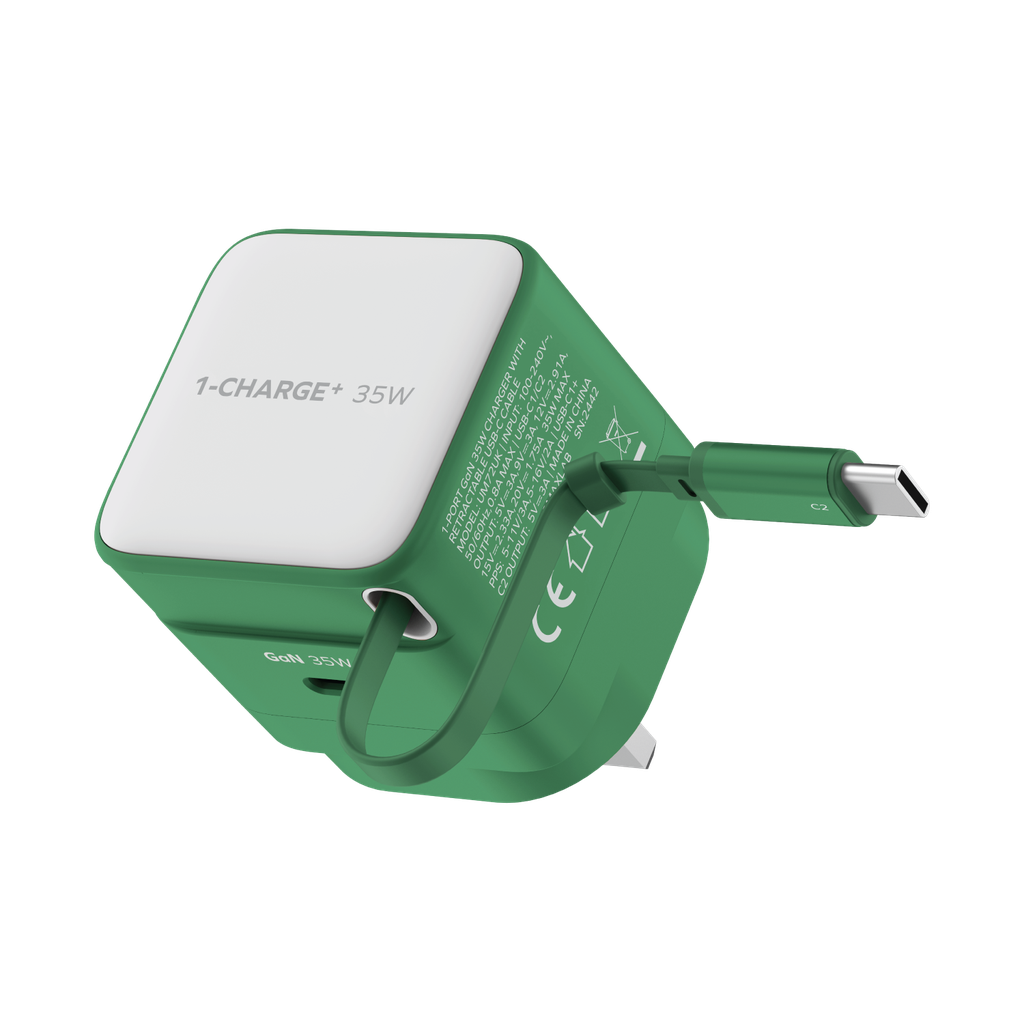
Momax 1-Charge+ 1-Port GaN 35W charger with Retractable USB-C Cable (Green)
There is no AI review summary.
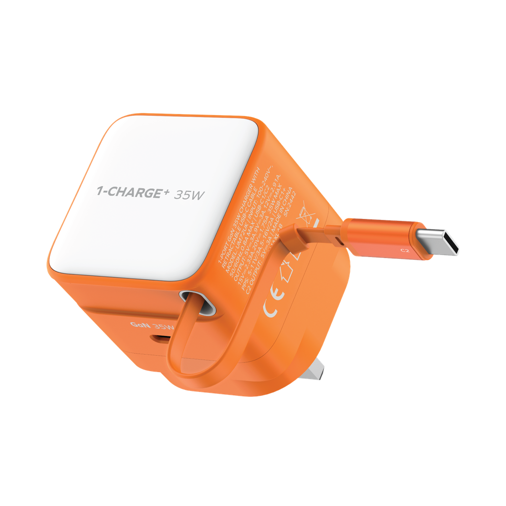
Momax 1-Charge+ 1-Port GaN 35W charger with Retractable USB-C Cable (Orange)
There is no AI review summary.
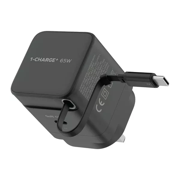
Momax 1-Charge+ 1-Port GaN 65W charger with Retractable USB-C Cable (Black)
There is no AI review summary.
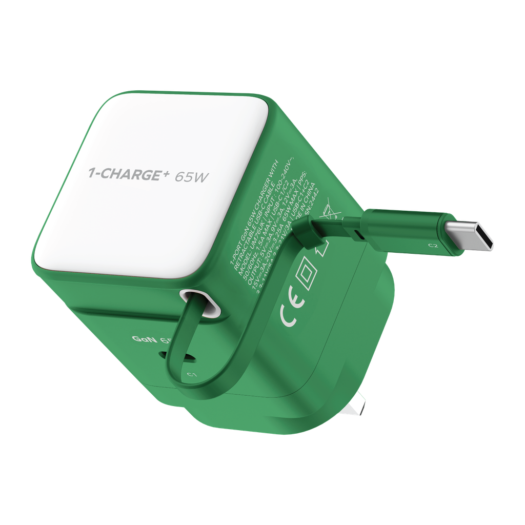
Momax 1-Charge+ 1-Port GaN 65W charger with Retractable USB-C Cable (Green)
There is no AI review summary.
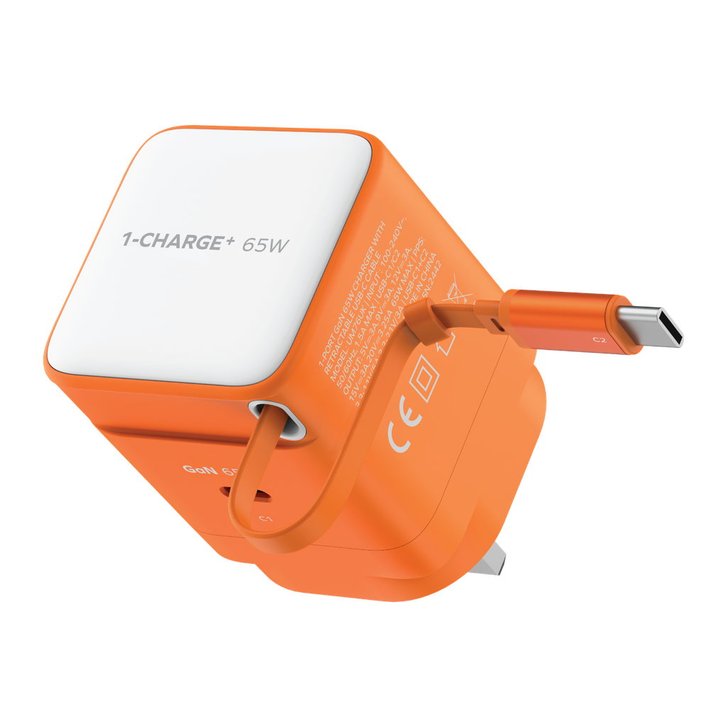
Momax 1-Charge+ 1-Port GaN 65W charger with Retractable USB-C Cable (Orange)
There is no AI review summary.


Momax 1-Link Flow CL+ USB-C to Lightning Braided Cable 2m (White)
There is no AI review summary.
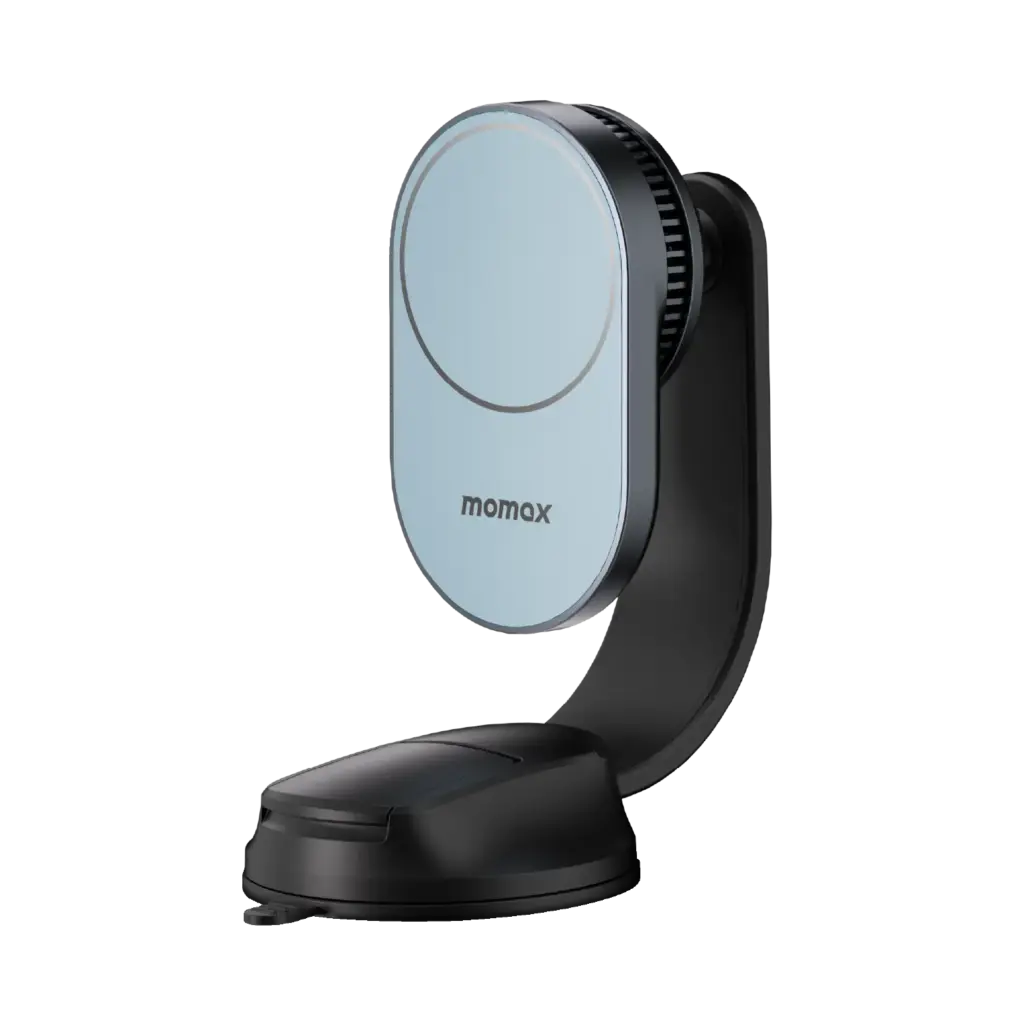
MOMAX 1-MOVE Q.Mag 25W Magnetic Wireless Charging Car Mount (Dark Grey)
There is no AI review summary.
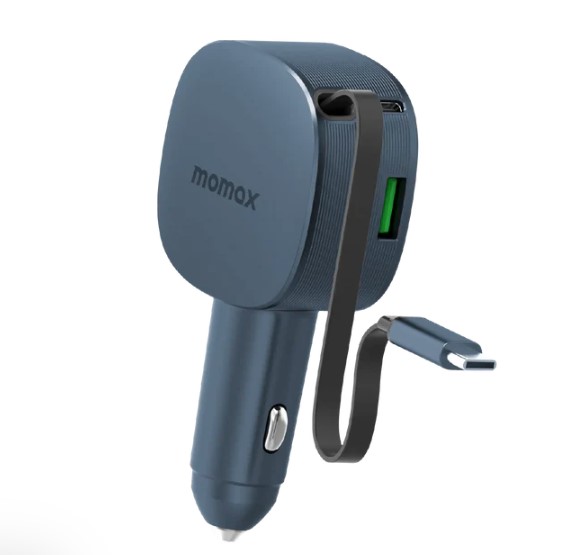
Momax 1-MOVE+ 60W 2-Port Car Charger with Built-in Retractable cable (Grey)
There is no AI review summary.
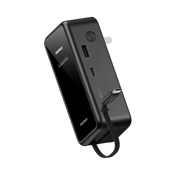
MOMAX 1-PAC⁺10000mAh 3 in 1 Hybrid GaN Battery Pack with Build-in retractable Cable (Black)
There is no AI review summary.
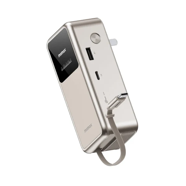
MOMAX 1-PAC⁺10000mAh 3 in 1 Hybrid GaN Battery Pack with Build-in retractable Cable (Titanium)
There is no AI review summary.
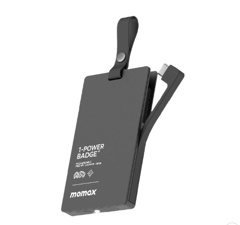
Momax 1-Power Badge+ Emergency Power Bank With Find My Locator (Black)
There is no AI review summary.